Stage 04 · The Print
Papers and blacks
Matte papers cannot reach the black a gloss surface can. The choice sets the tonal floor before anything else.
Entry 1 of 4 in The Print, the fourth of seven stages between the shutter and the shelf.
The tonal floor is set before you open the file
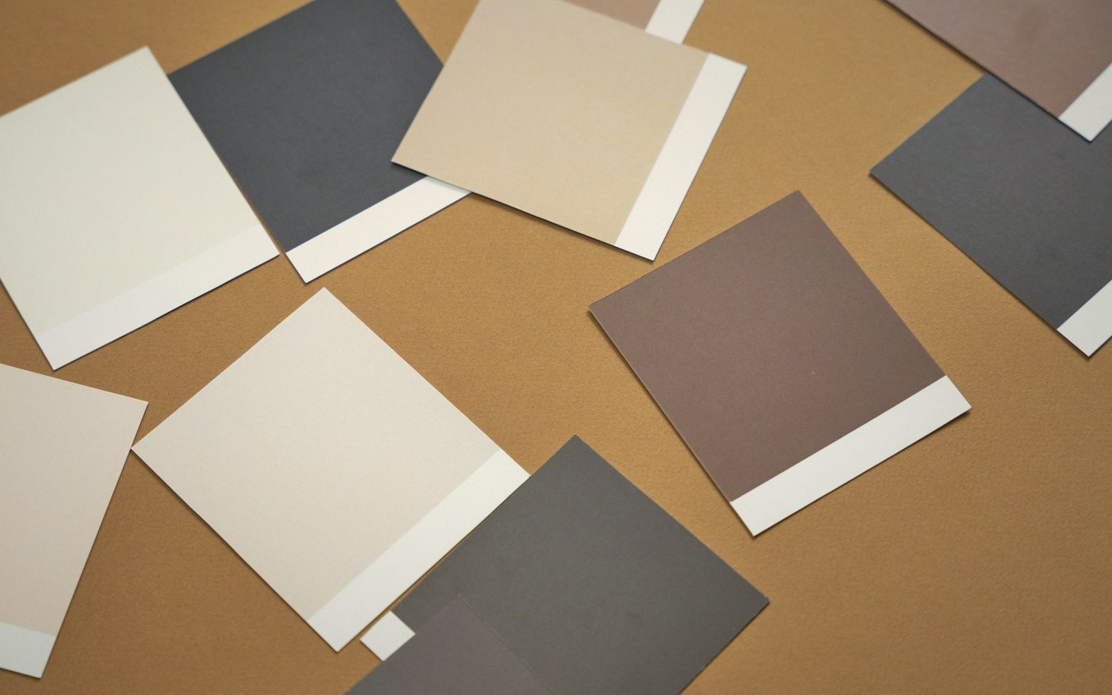
Before a single tone is balanced, before a dodge or burn is applied, the paper you choose has already decided the darkest dark your print can hold. This is not a preference — it is physics. And photographers who spend hours on shadow detail in a file and then hand that file to the wrong surface will watch the work collapse.
The mechanism is straightforward. A glossy or baryta surface is coated to reflect light at a consistent angle; when you look at the dark areas, very little light bounces back from them, and the black reads as deep and closed. A matte surface, by contrast, scatters light in all directions — it is this scattering that gives the surface its characteristic softness, its freedom from glare. But the same scattering means light always bounces back from shadow areas, lifting the floor. You cannot have the visual texture of a fine-art matte and the absolute black of a gloss. The properties are inseparable.
The figure photographers use to talk about this is Dmax — maximum density, the deepest measurable black the surface will produce. Gloss and baryta surfaces typically achieve substantially higher Dmax values than matte and fine-art cotton surfaces. The gap is not marginal; in practical printing terms it is the difference between a black that reads as black and one that reads as very dark grey. Neither is wrong. But they are not interchangeable.
What this means for an edit
The choice is not simply technical. A lighter tonal floor changes what the image says. Shadow detail opens up on matte — information that disappears into pure black on gloss becomes visible, which can be either a gift or a problem depending on the work. A portrait where you wanted the background to collapse entirely into black will not collapse on cotton rag; it will linger. A landscape where you wanted to preserve the texture inside a dark rock face may give it back to you.
This is why paper choice belongs in the edit, not after it. Deciding the surface late — once you have a sequence you love on screen or in a work print — means you may need to reopen files you thought were finished, or discover that the tonal argument you were making only functions on one kind of surface. Photographers who move between surface types regularly will tell you that certain images belong to gloss and others belong to matte, in the same way that certain images belong to horizontal and others to vertical. The picture has a nature; the surface either confirms it or works against it.
Baryta paper — named for the barium sulphate layer that historically coated darkroom fibre-based papers — sits in an interesting middle position. It has the high Dmax of gloss without the mirror-like reflectance of a standard gloss surface, which is why it became the material associated with fine exhibition printing. The surface has a slight tooth, a visual weight, a sense of holding the image rather than sitting under it. It remains a strong choice when deep blacks and some surface texture both matter.
Reading the shadows before you commit
The practical discipline is to test on the intended surface before finalising any shadow work. A proof printed on a matte cotton to evaluate blacks and then migrated to baryta will have different shadow rendering and will need adjustment. This seems obvious, but it is regularly skipped — partly because test prints cost time and money, and partly because photographers have become accustomed to trusting the screen as a final reference. The screen emits light; it cannot model the way a surface scatters or absorbs it. A calibrated screen in a well-lit room is valuable, but it will always flatter the shadow end relative to what a matte surface delivers.
The editors and printers who do this well develop a fairly quick instinct for it: they look at a file and ask where the blacks need to land, and the answer tells them which direction to go. A large-format landscape with compacted dark tones and fine mid-shadow detail probably wants baryta or gloss. A delicate, even-lit series of still-life work — where the shadows are modest and the surface texture carries meaning — probably wants matte, and its lighter tonal floor is not a loss but a fit.
The paper is not neutral. It is part of the image. Treat it accordingly.