Stage 04 · The Print
Toning
A colour shift through the greys, historically chemical, now usually not.
Entry 2 of 4 in The Print, the fourth of seven stages between the shutter and the shelf.
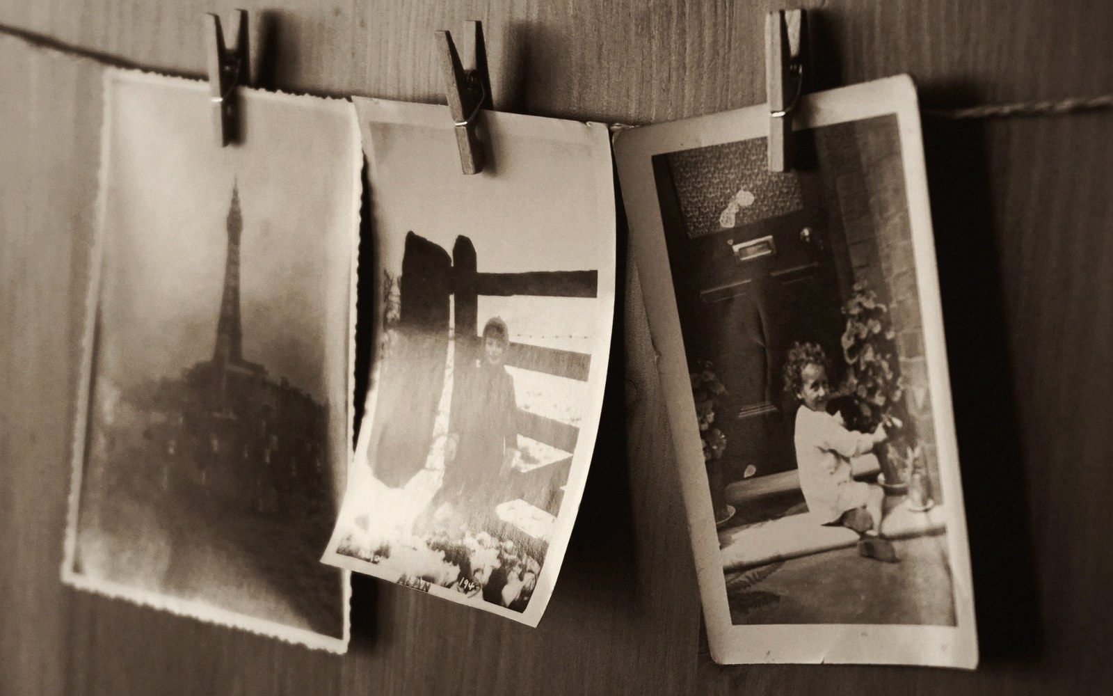
A colour shift through the greys, historically chemical, now usually not
Silver gelatin prints made without any further treatment are not truly neutral. They carry a slight warmth or coolness depending on the paper base and developer, and they shift over time as the silver itself oxidises. Toning — the deliberate alteration of a print's colour balance — began as a preservation step. It became an aesthetic choice. The two purposes were never entirely separate.
The chemistry behind the shift
Traditional toning works by replacing or coating the silver particles that form a photographic image. Selenium toner, the most common in darkroom practice for most of the twentieth century, converts the metallic silver to silver selenide, which is more stable and slightly cooler in shadow, often described as a faint plum or violet at full strength. At diluted working concentrations — one part toner to ten or twenty parts water — the visible colour shift is subtle, and most photographers use it primarily for its archival benefit rather than its hue. Sepia toning is more aggressive: the silver is first bleached back to silver bromide, then converted to silver sulphide by the sulphur compounds in the toning bath. The result is the warm brown familiar from Victorian portraiture and pictorialist prints, and it is almost immune to atmospheric oxidation over the long term. Gold toning, by contrast, deposits a thin layer of gold over existing silver, shifting highlights toward blue and adding to physical stability. Many photographers working in the mid-twentieth century used gold as a final stage after selenium, balancing the shadow warmth against a cooler highlight to produce what they considered a full, complete tone.
These are not cosmetic effects applied on top of an image. They alter the underlying chemistry, which is why toned silver prints genuinely outlast untoned ones — and why the colour the toner produces cannot simply be mimicked by printing on a warm-toned paper. The material change is real.
Now usually digital
The darkroom practice persists among a small number of printers, but the term has migrated almost entirely to digital contexts where no chemistry is involved. In printing software and most image-editing applications, toning means introducing a global colour cast to the grey tones of an image — typically a warm buff into the highlights, a cooler shift into the shadows, or both simultaneously through a split-tone approach. Split toning, where highlights and shadows are shifted toward different hues, was popularised by the zone system printmakers who noticed that a cooler shadow paired with a warm highlight gave a sense of depth and separation that flat neutral grey did not. Digitally, the curve controls required to produce this are straightforward; the result can strongly resemble a chemically toned silver print, or it can diverge entirely into territory no chemistry ever produced.
Whether the digital version is "toning" in any meaningful sense is a question worth sitting with. The print produced does not carry archival advantage. The colour shift is real in the output but reversible in the file; nothing is transformed. What is shared between the chemical and the digital approach is the visual grammar — the way a warm tone draws a black-and-white photograph toward a specific emotional temperature, the way a blue-grey cast distances it. The decision is still a tonal one. It still determines what the shadows feel like and whether the highlights feel airy or dense.
What it changes in the reading
Toning sits at the edge of what most photographers think of as editing, because it operates on the whole print simultaneously rather than on individual frames or sequences. It is a material decision, not a curatorial one — but it belongs to the same set of choices as papers and blacks, because it sets the emotional floor of the work. A warmly toned suite of prints reads differently hung or bound than a cool-grey one, even when the subject matter and the sequence are identical. This is worth testing before committing: a work print at a consistent tone will tell you whether the warmth helps or flattens, whether the shadow shift holds the image or muddies it. The chemistry, where it exists, is irreversible. The decision should not be made late.